A mobile application that aims to guide people to find comfort in their living space by sharing knowledge and providing structure to decluttering and organizing.
THE CHALLENGE
People have a hard time deciding how to declutter and organize their space. Clutter can lead to a feeling of being overwhelmed by their space, while a poorly organized space can reduce satisfaction and comfort.
There are many challenges people face with disorganization, and includes causes like burnout, mental health struggles, and lack of time.
THE SOLUTION
The Airis app guides and teaches users on decluttering and organizing by providing videos and articles on methodology, technique, examples, and tips & tricks, on tidying their space.
The app also provides other features as well to upkeep accountability and motivation to tidy through user discussion pages and task/timer functions.
CASE STUDY
RESEARCH
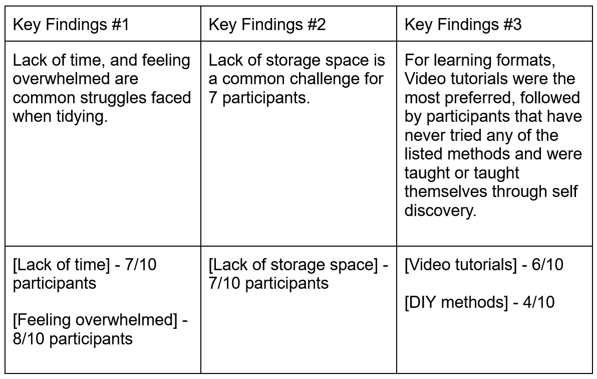
To better my understanding on disorganization related causes and struggles, primary and secondary research was conducted.
My secondary reserach of diving into possbile causes of disorganization helped to inform my primary research, which was a survey.
A short 10-minute survey was distributed to friends on social media. The questions this survey aimed to uncover were:
How can participants be taught to declutter and organize efficiently and effectively?
What are some prevalent reasons for disorganization ?
What motivates users to declutter/reorganize ?
IDEATION
To inspire and craft efficient solutions for design challenges, I used “how might we” (HMW) statements as a framework to come up with possible solutions.
Some HMW statements I came up with were:
How might we lessen the overwhelming feeling that comes with decluttering and organizing?
How might we make decluttering and organizing an efficient process that accommodates for various lifestyles?
How might we enhance the overall functionality and aesthetic of one’s house to promote well-being and satisfaction?
How might we work around the obstacles of different sized spaces?
How might we work with the emotional factors that come with decluttering and organizing one’s space?
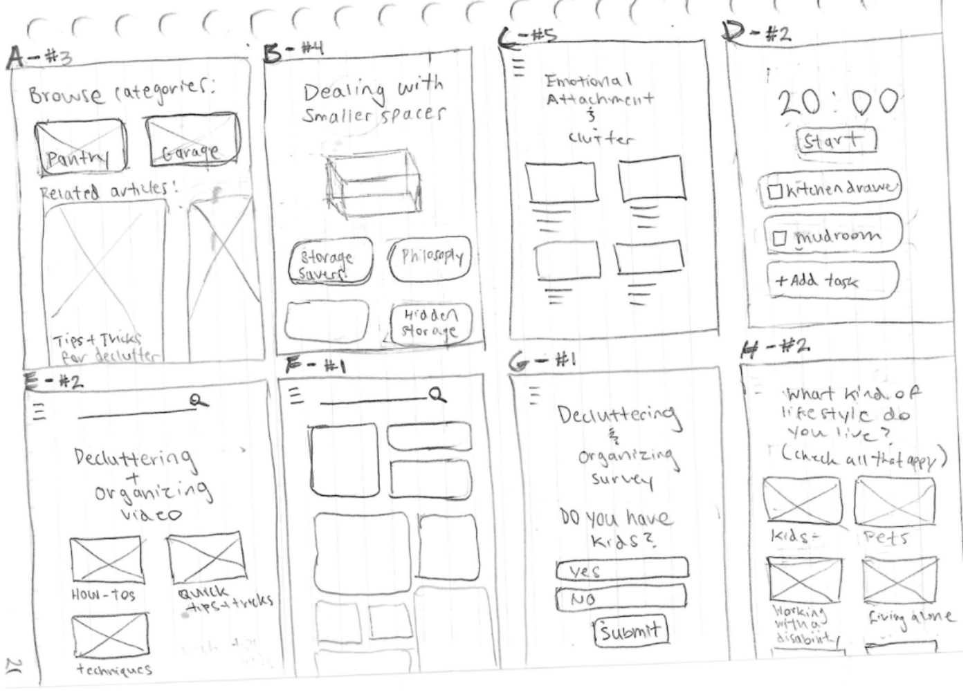
I then used those solutions to guide sketches of the interface design. I used the crazy 8 method to jot down quick sketches of ideas that could efficiently answer the HMW statements
USER STORIES
To help gather and address the most crucial user needs, the user stories helped in prioritizing major pain points from greatest to least. It also helped to visualize specific features that would correlate to those needs. These are the top five most prioritized stories:
As a user, I want my content to be curated towards my challenges and type of lifestyle so that I can quickly find solutions or ideas for my space.
As a user, I want to be able to browse and organize content by categories so that I can reduce the feelings of being overwhelmed and confused.
As a user, I want to be able to watch videos on decluttering and organizing techniques, methodologies, and tutorials, so that I can learn to keep a clutter-free space.
As a user, I want to receive advice on how to deal with emotional attachment to items so that I can declutter properly and efficiently.
As a user, I want to learn methods and techniques that will act as a rule of thumb so that I can make decluttering and organizing an easier process.
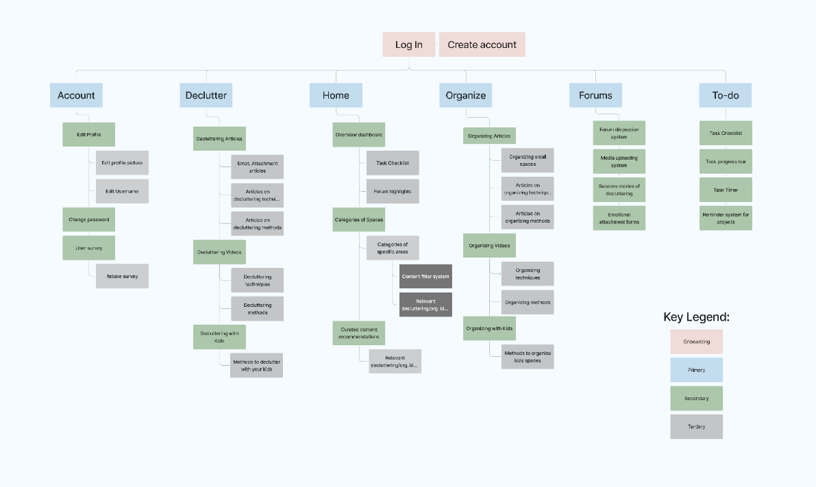
SITE MAP
With the user needs now defined and written out, I used Figjam to craft the site map. The information was laid out on a site map and provided a visual on how the information would flow within the app
Providing a clear way to obtain clarity on the relationships between certain features and how they would interact.
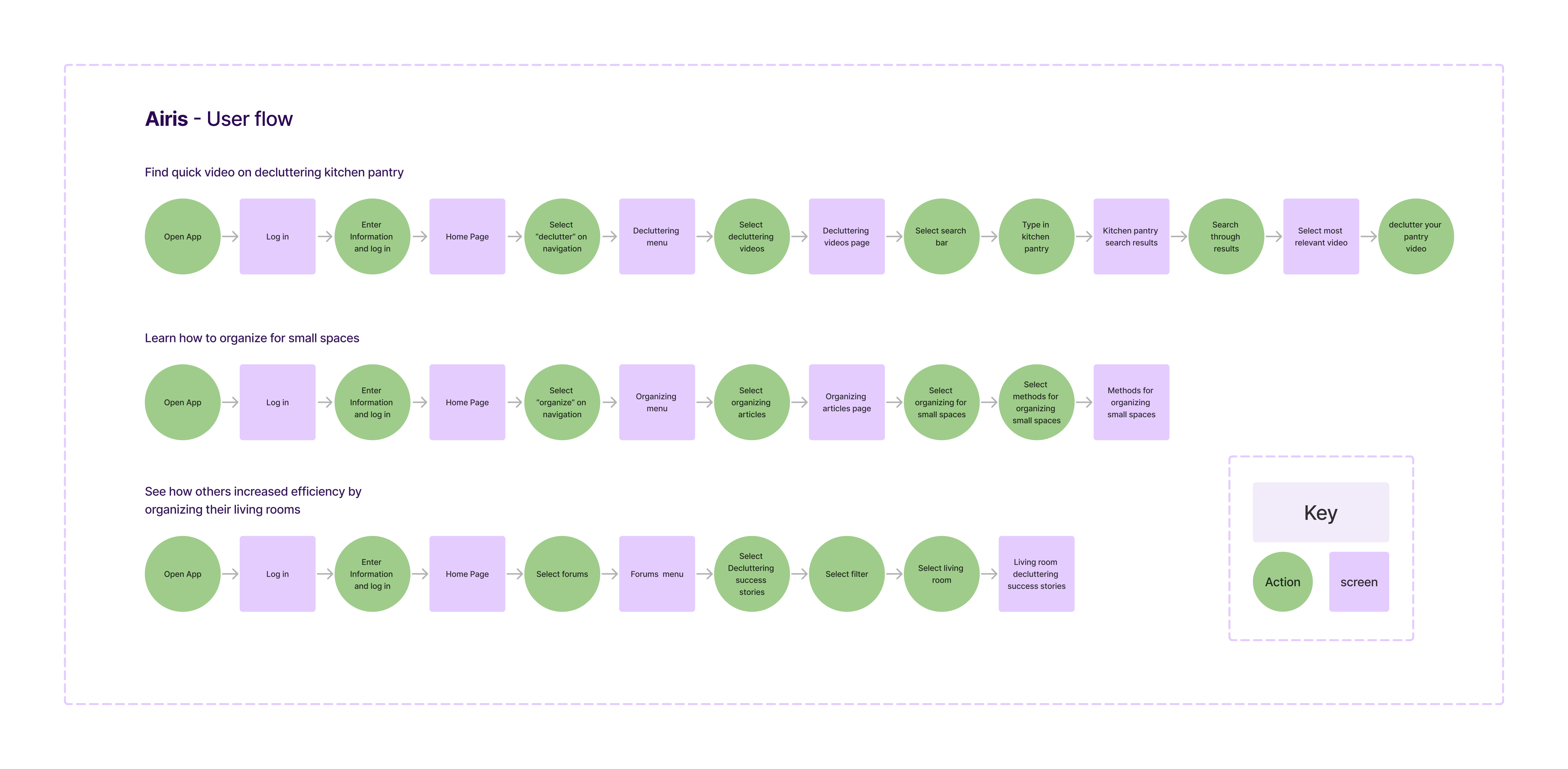
USER FLOW
I wrote three user flows to address the most prominent user needs. These flows indicate the direction users can take within the app.
Find quick video on decluttering kitchen pantry
For users who lack time and are looking for video tutorials, this could be a quick way to find a tutorial on the fly.
Find an article on organizing in small spaces
Taking into account different types of living spaces like size is important to include various users.
Find a success story on living room decluttering.
This flow is important because interacting with and reading other’s successes or ideas are important to not feel isolated and unmotivated.
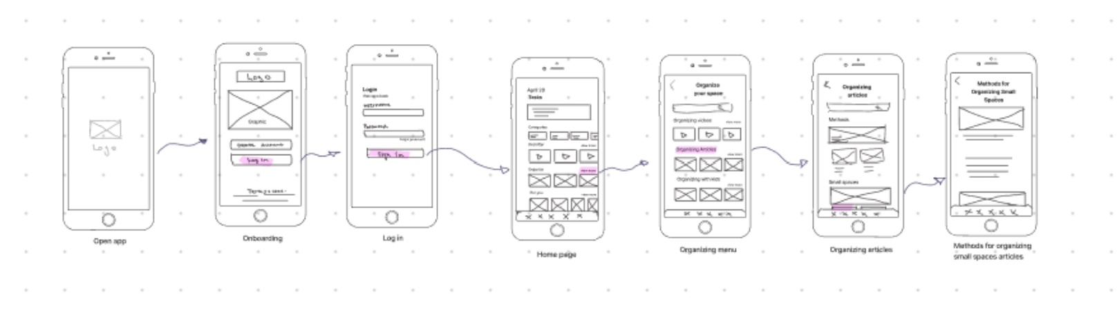
SKETCHES
After establishing the user flows, I sketched out them out into different screens, which helped to understand how everything would interact.
It also provided many opportunities to fix any gaps in intuitiveness that went unnoticed while I was writing and brainstorming. After finding the gaps and inconsistencies, some features were added to ensure consistency and a smooth user flow as well.
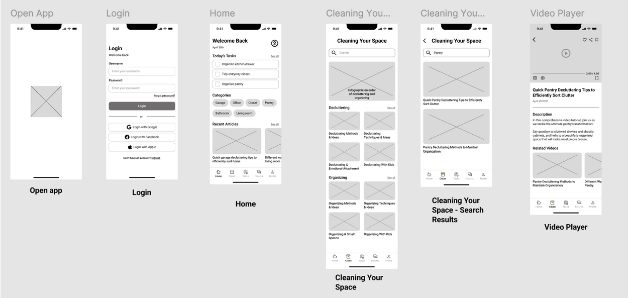
WIREFRAMES
For the wireframes, I initially kept everything the same after translating the sketches into Figma, except for a couple features. I then added more UI details like categories, labels, titles, and logos as well. Additionally, I added a recent articles feature that replaced the “for you” section for more convenience. The transition required me to edit the UX to better replicate conventional sizes and placement of elements.
Moreover, moving from lo-fi to med-fi increased my understanding of how the final project would look like. With the new perspective, it allowed for better design decision-making like removing or adding features in addition to ideas for what I would want in the later stages
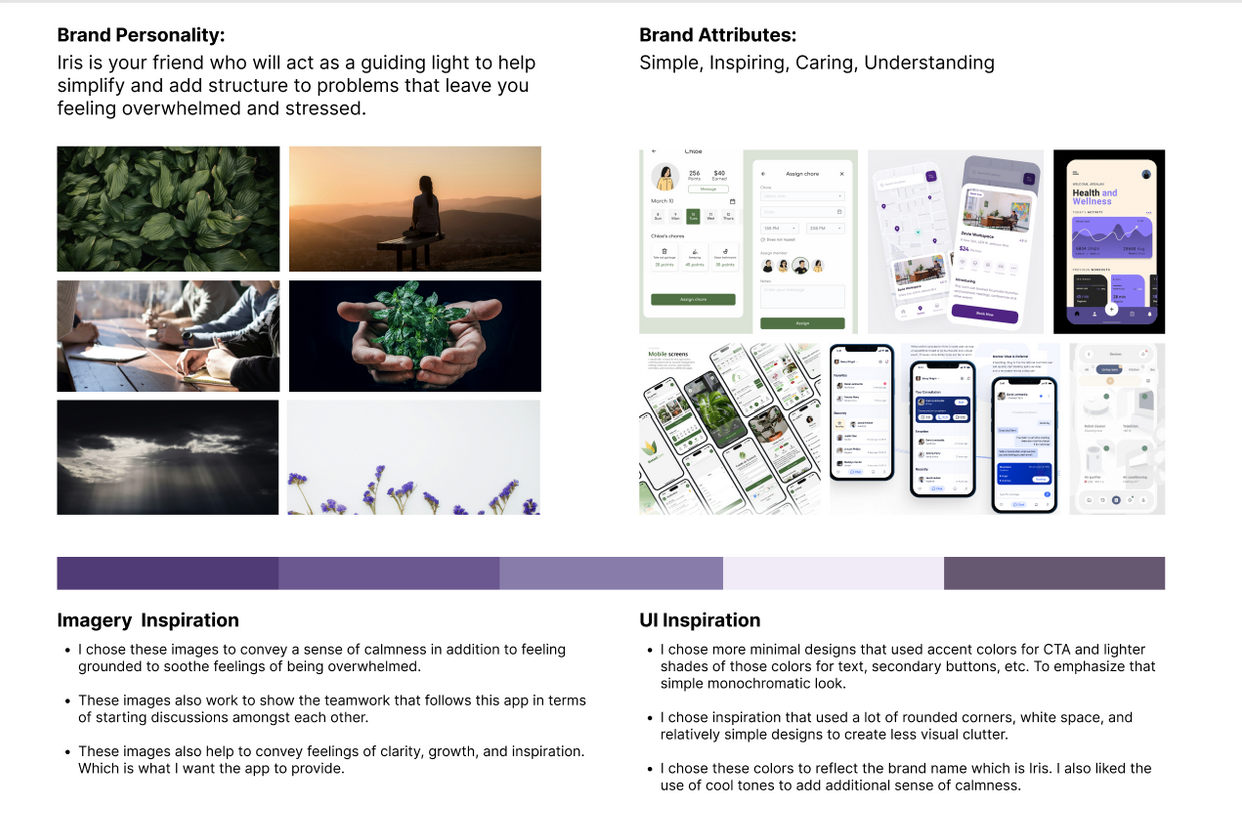
PLATFORM & MOODBOARD
For the brand platform, I wanted the brand to reflect guidance and teaching, so I chose symbols that aligned with those attributes.
Some key elements from my mood board were the sample screens, they were mainly chosen because they reflected a design that was calm and simple (like using rounded corners, cool toned colors, etc.) I wanted to draw a lot of inspiration from these screens because their design was very effective in creating a calm and comfortable space
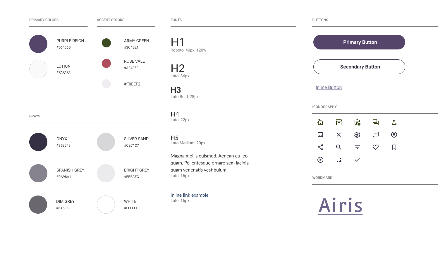
STYLE GUIDE
I chose to go for a color palette that was relatively cool toned and maintained an unobtrusive and calm feeling to the app. This choice was mainly to make the experience a pleasant one for overwhelmed or stressed individuals.
For that reason I chose a deeper purple for the primary, subtle off-white, and a muted shade of green. My choice in font styles also reflected the goal to help calm users while maintaining simplicity.
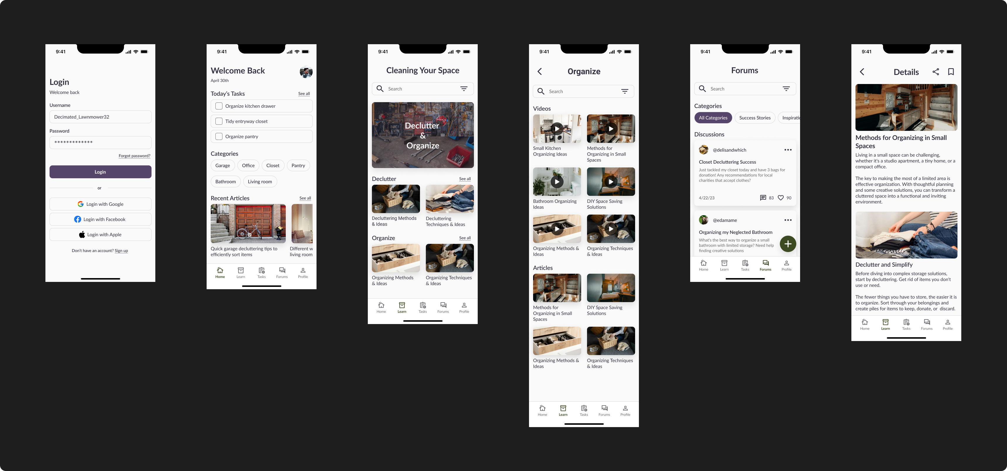
HI-FIDELITY SCREENS
For the hi-fidelity UI’s My mood board and style guide provided guidance on the placement of elements that were needed to transition to hi-fi.
Furthermore, the most challenging aspect was finding cohesive images that were royalty-free for the app. I first utilized images, but after a bit, I started to run out of relevant images, so I opted for photographed images instead.
The color palette was also very difficult to navigate. Learning that a little goes a long was definitely did the trick and eventually, I was able to successfully be ready for the prototyping stage.
USER TESTING
To gain insight into the efficiency of the application, usability testing was conducted. 5 participants were recruited and tested via remote moderated user testing to gain a better understanding of the usability of 3 main flows:
Find a video on decluttering kitchen pantry
Learn how to organize small spaces
Find other users' success stories on decluttering their living room.
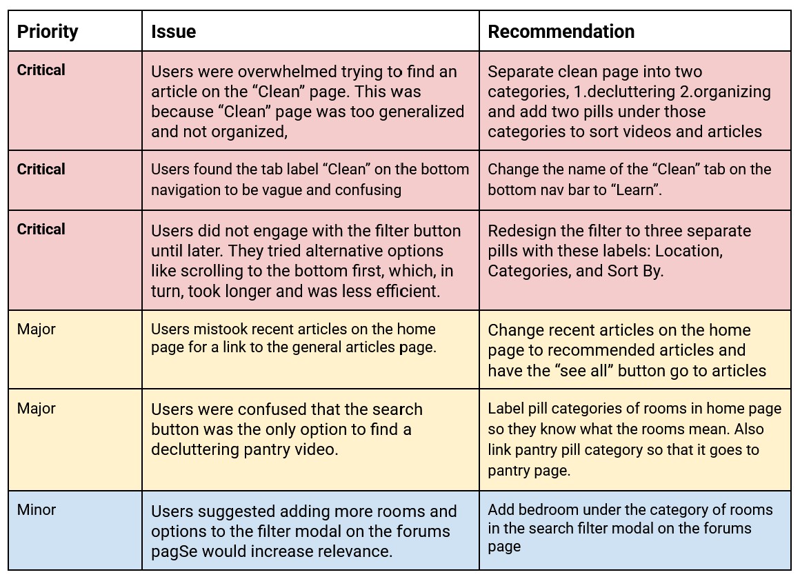
Findings
The most prevalent findings were that users got lost trying to navigate the “clean” and “forums” page. Users also did not have much direction on completing tasks because certain screens lacked signifiers to hint at the required action.
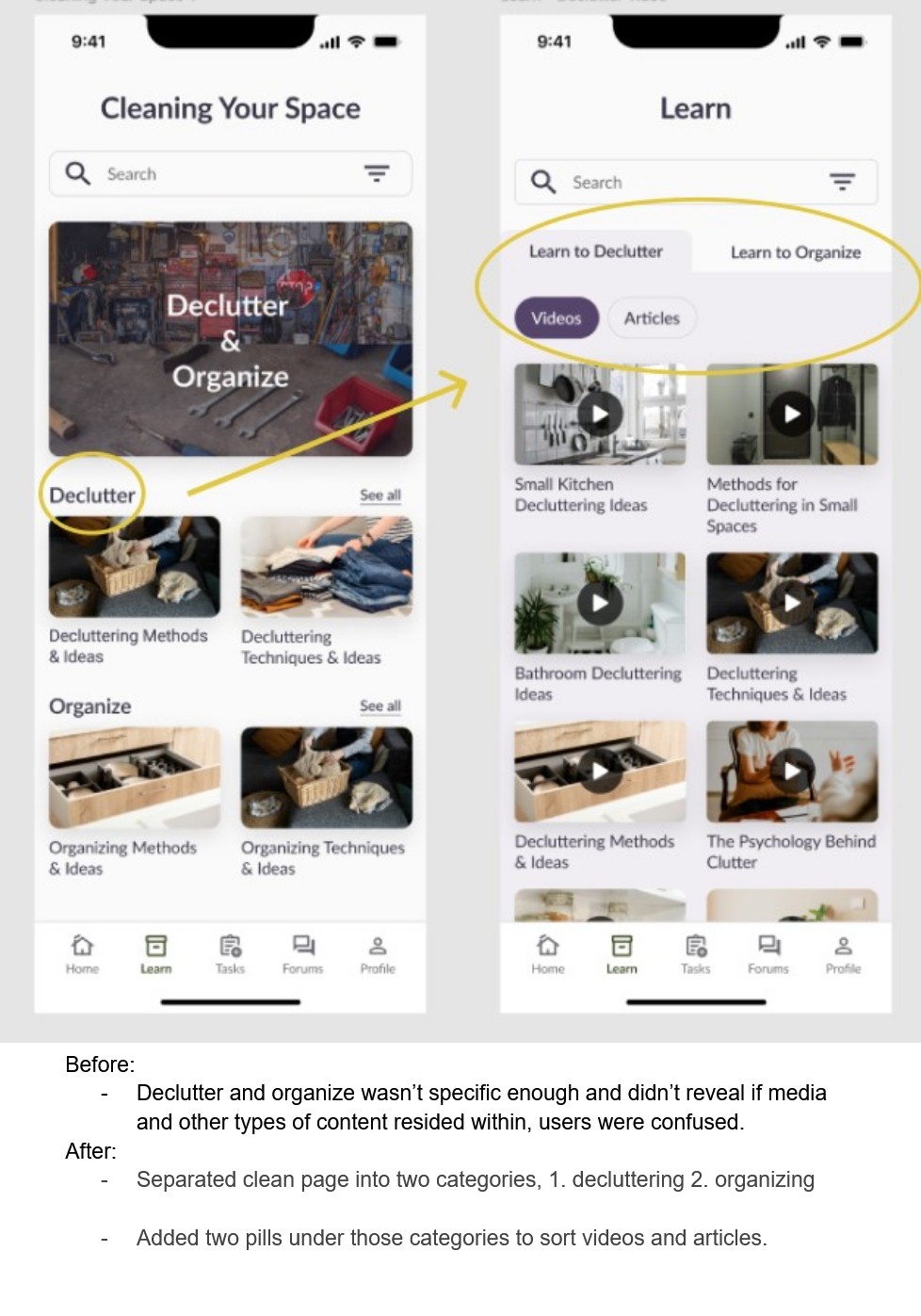
REDESIGN
With the information gathered from the user testing, I gained a better understanding for inefficiencies within the design. With that knowledge, I implemented new designs to address those problems. This is an example of the changes I made to my design.
REFLECTION
This project definitely taught me a lot of things in terms of UX/UI work and provided me with many opportunities to contribute to my skill set as a designer.
I think the biggest challenge that I faced while working on this project was when I was analyzing the user testing results. Finding a solution to the inefficiencies in the app was very difficult, this was mostly because the different elements and user flows were nested neatly in a system, so everything felt like it was already set in stone.
The situation made thinking outside the box more difficult, so to combat this, I decided to break down the user flows to inspect each step, and helped to notice the inconsistencies. This ultimately led me to uncover better solutions for the app design.
If I were to do this project differently, I think I would’ve taken more detailed notes on the process of the design journey. This is also just a general aspect I would like to work on, which is the onboarding aspect to the app. There were a couple ideas I was looking forward to executing, but unfortunately were not in the scope of the project.
All in all, this project helped to cultivate a lot of self growth as a designer and provided me many challenges that helped to push me out of my comfort zone. I am glad the topic of this project was something I was interested in, and hope to pick this project back up again some time in the future.